|
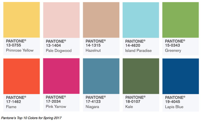
New season, new trends! I've wanted to branch out for nail posts and when stuck for ideas a fellow Canadian blogger gave me the idea to look at Pantone's colour of the year. This year Greenery is our colour & the other 9 shades are ones that were seen on the runways of the many global fashion weeks. I decided to look through my collection to find some shades to help you rock these colours for Spring/Summer 2017!
For each of the colours I tried to find ones as close as possible to the shade, but for some I didn't have quite the colour so I chose ones that were close enough or give off the same vibe. I'm going to include the Pantone description of each of the colours which I found here if you'd like to read more into it. So let's jump in!
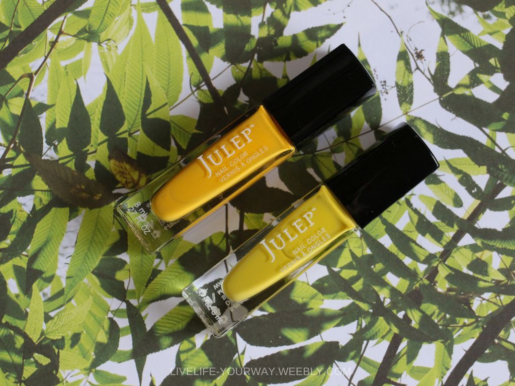
Primrose Yellow
"Inviting us into its instant warmth, this joyful yellow shade takes us to a destination marked by enthusiasm, good cheer and sunny days." I've chose two Julep colours Catrina (top) and Dawn (bottom).
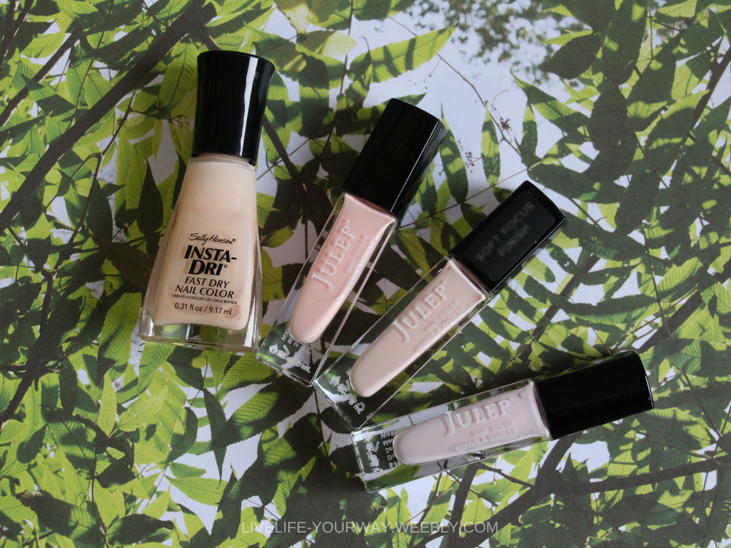
Pale Dogwood
"...is a quiet and peaceful [subtle] pink shade that engenders an aura of innocence and purity." First, Sally Hansen Petal Pusher, and three Julep shades in Jules, Janet and Carla. Each of the shades are quite close to each other with only subtle differences in tone (varying from more peach to more pink).
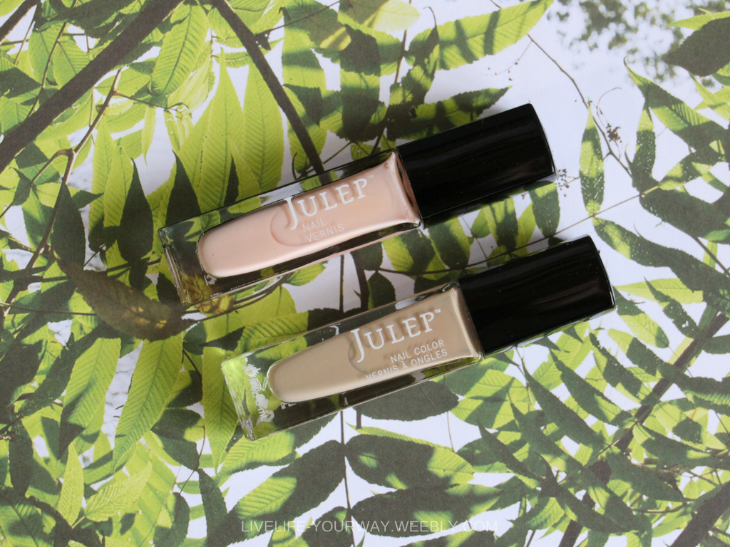
Hazelnut
"This shade brings to mind a natural earthiness. Unpretentious and with an inherent warmth, Hazelnut is a transitional colour that effortlessly connects the seasons." For this I chose two Julep shades: Penelope and Lizzy. Lizzy to me is the perfect match but for those who find the colour too brown for them Penelope is a more peachy nude.
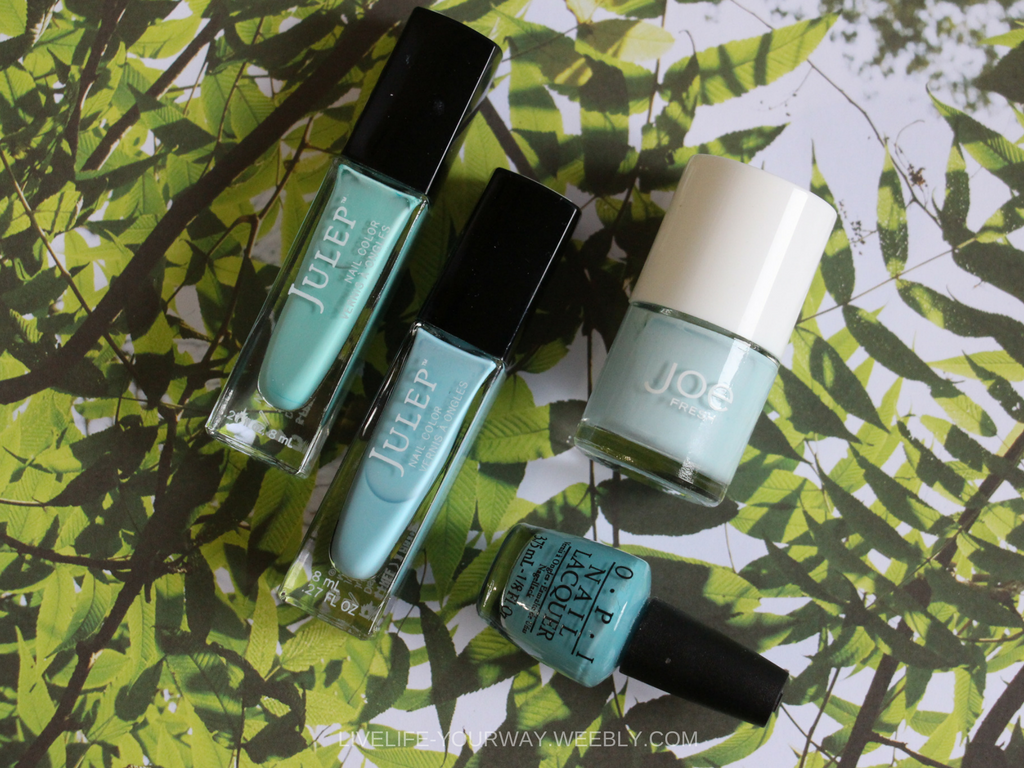
Island Paradise
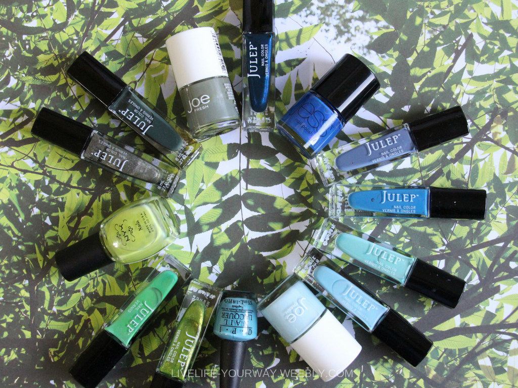
"...refreshing aqua that calls to mind a change of scenery. A cool blue green shade that speaks to our dream of the great escape..." Shades: Julep Alyssa and Bess, JOE Fresh Wave and OPI Can't Find my Czechbook. This one was harder for me to find in my collection so as you can see the colours range quite a bit, especially when placed so close together. Julep Alyssa is definitely the most blue green, bordering on seafoam in comparison to Bess.
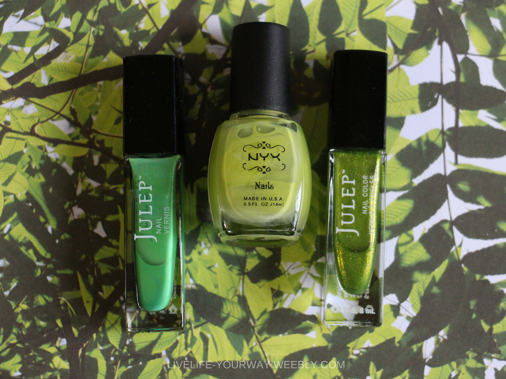
Greenery
"Bringing forth a refreshing take, Greenery is a tangy yellow-green that speaks to our need to explore, experiment and reinvent." Shades: Julep Leah, NYX Lime and Julep Tammi. The colour of the season was also tricky to find in my collection and then I dug deep into the abyss of my collection & remembered I had this NYX colour, which was a perfect fit.
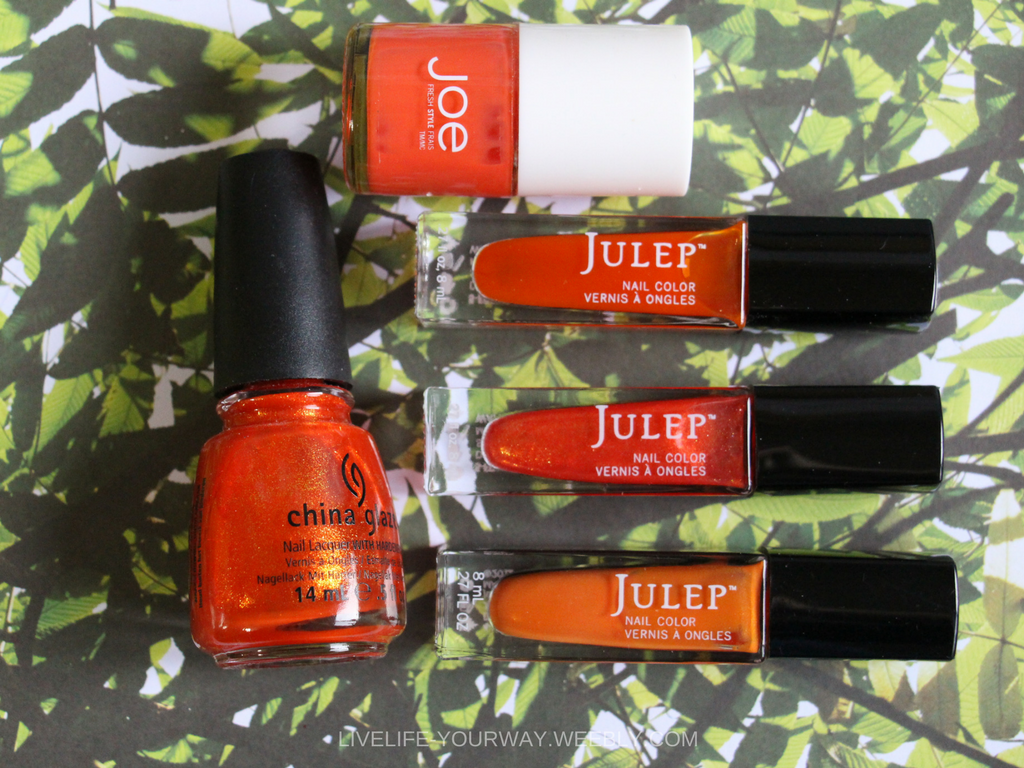
Flame
"A red-based orange, Flame, is gregarious and fun loving." Shades: China Glaze Riveting, JOE Fresh Papaya, Julep Gigi, Kirti and Marjorie. This was an easy one to find and as you can see I had the most of this fun shade. Each of these colours has a different finish to it to make it different from the rest. Marjorie is probably the most true orange shade in the bunch and Riveting/Kirti the more red-based shades. They are all great shades for SS17.
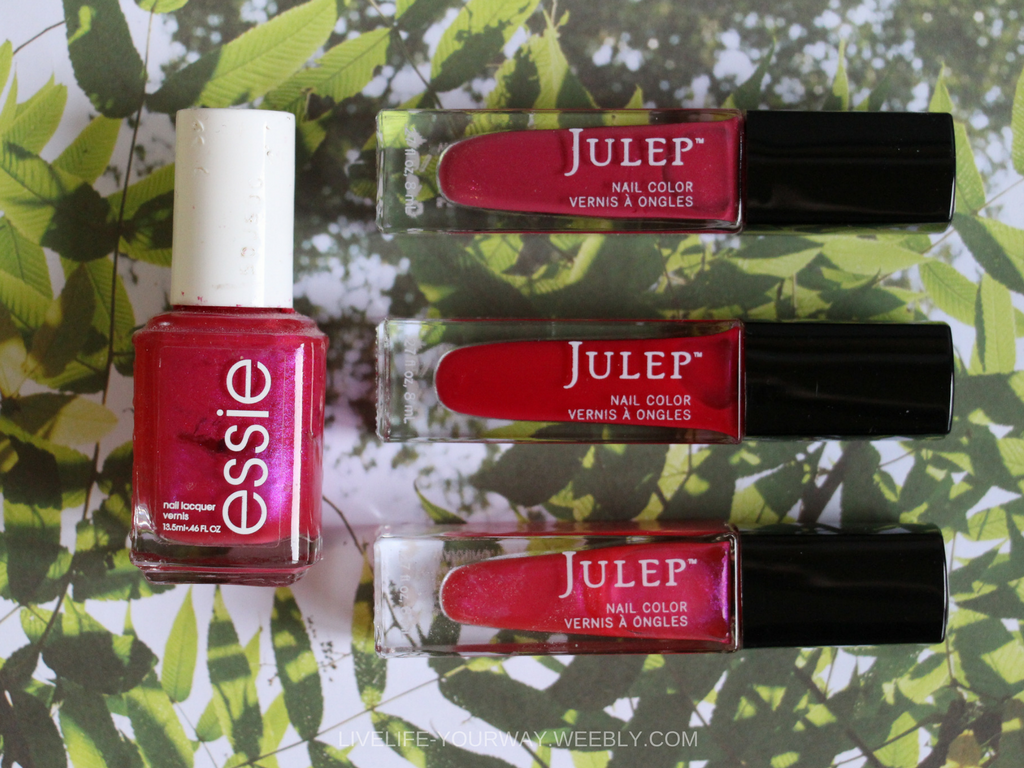
Pink Yarrow
"Tropical and festive, Pink Yarrow is a whimsical, unignorable hue that tempts and tantalizes." Shades: Essie Miami Nice, Julep Adeline, Ari, and Polly. This shade seemed to be another one I had several versions of, again each with a different finish. I would say the Essie shade and Polly are almost perfect dupes for each other in case you can't get your hands on one of them.
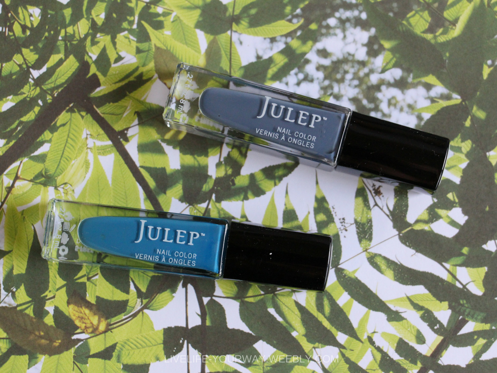
Niagara
"...is a classic denim-like blue that speaks to our desire for ease and relaxation." Shades: Julep Nedra and Linden. Denim is always on trend and either of these shades could pull them off; I'm ever so slightly pulled towards Nedra as it has a cooler grey base to it which I find to be rather unique.
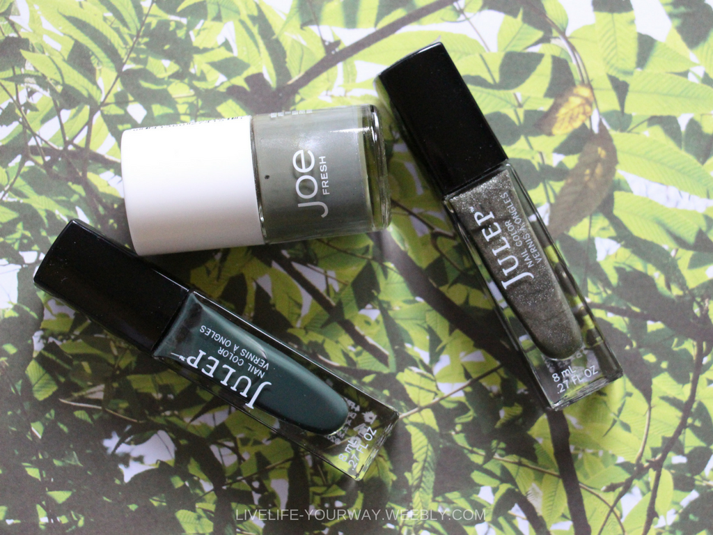
Kale
"...is another foliage-based green that conjures up our desire to connect to nature, similar to the more vivacious Greenery." Shades: Julep Roc Solid, JOE Fresh Khaki and Julep Hailee. I would say these are the closest I have to this second leafy colour, being more deep and closer to olive I picked up Khaki and Hailee; Roc Solid has more of a deep blue tone through it.
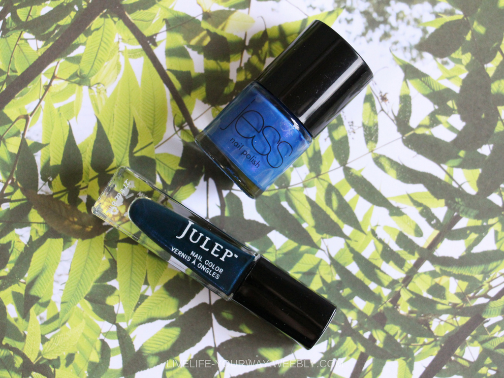
Lapis Blue
"Strong and confident, this intense blue shade is imbued with an inner radiance." Shades: Julep Gladys and Jess Calypso. This shade is another one that I struggled with finding in my collection, so these two are the closest I could come to the shade in the Pantone photo.
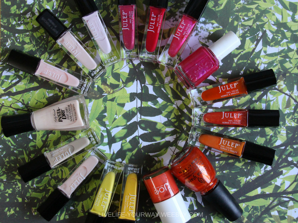
You just had to know that I would ROYGBIV these colours because rainbows are just so satisfying to look at. Unfortunately, I couldn't fit them all together so I broke it up to more warm/cool colours.
So I want to know, which Pantone Spring Trend colour is your favourite? least favourite? Would you wear Greenery on your nails (or perhaps only your toes?) If I had to pick a favourite, I would have to pick Flame and Island Paradise as my top two; but I definitely enjoy all the other shades! I'm never afraid to add colour to my fingers or toes so I will definitely be cycling through these shades over the next few months.
Connect with Me
YOUTUBE - Sydneexo INSTAGRAM - @livelifeyourway TWITTER - @sydnee_xo FACEBOOK - Sydneexo SNAPCHAT - @syd_xox
5 Comments
4/10/2017 06:50:42 pm
Wow these are all such awesome colors! I'm very excited :)
Reply
4/10/2017 08:07:11 pm
The julep gladys is really cool. The reds are really vibrant, too.
Reply
Leave a Reply. |
CategoriesAll China Glaze Christmas Collection Crackle Creanails Designs Diy Easter Gap Inc Girlie Hard Candy Haul Imats ImPRESS Joe Fresh Julep La Colour Mani Monday Mini Collection Muted Nail Art Nail Polish Notd Nyx Opi Pastels Review Reviews Revlon Rimmel London Sally Hansen Seasonal Shatter St Patrick's Day St. Patrick's Day Subscription Swatches Tutorial Valentine's Day Video |
Social Media |
Contact |
© COPYRIGHT 2015. ALL RIGHTS RESERVED.
|



 RSS Feed